How to Curate a Wedding Gallery Editors Will Publish
Here's what our editors are looking at when reviewing submissions.
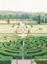
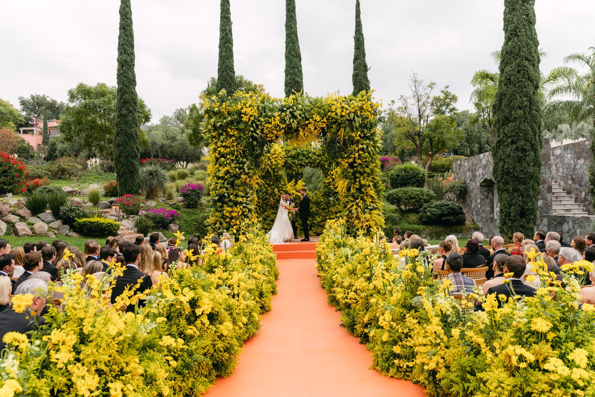
An editor opens your submission and starts scrolling. Before they reach your description, before they know the venue or the couple, they have already decided what kind of wedding this was. Your gallery told them.
Most submissions get assembled the way a portfolio gets assembled. Strongest frames first, favorites scattered throughout, anything quiet or ordinary left on the drive. That instinct is right for a portfolio, which exists to show what you can do. A submission has a different job. It hands someone else the raw material to build a story from, and it succeeds or fails on whether the story is all there.
What follows is what the Style Me Pretty editorial team is looking at when your gallery lands, with the specifics drawn from the published submission requirements. Photographers make most of these calls, so this is written to you. If you are a planner or a designer who assembles the submission, the same standards apply to whatever you send.
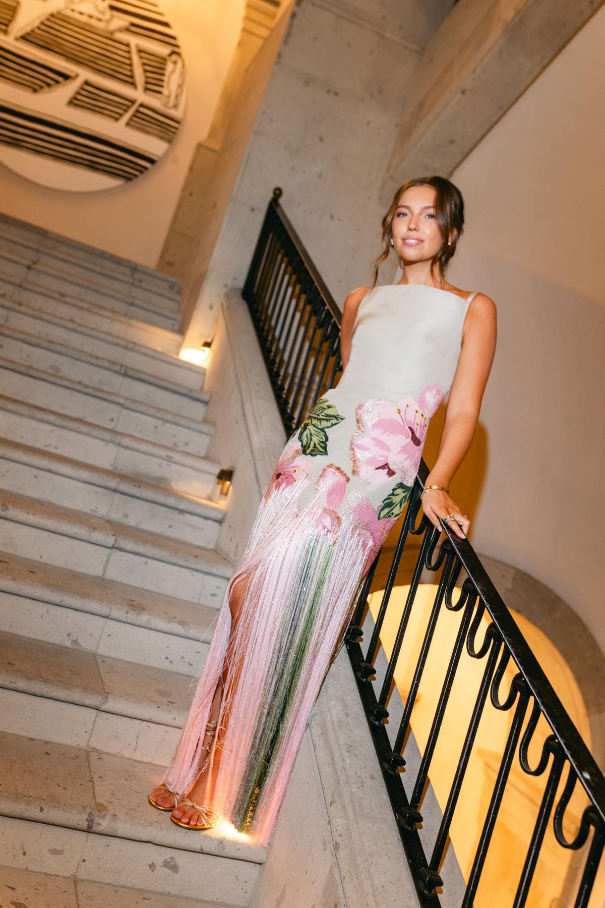
Think like the person who has to build a feature out of your gallery. Give them a day they can walk through from beginning to end, and every other decision gets easier.
1. Send the Whole Day
Style Me Pretty asks for 80 to 150 images that best highlight the wedding, each at least 900 pixels wide and no larger than 5MB.1 That range is worth reading twice, because it has a floor and a ceiling and both of them are important.
The floor is there because a thin gallery cannot be edited into a feature.
The ceiling is there for the opposite reason. Sending four hundred images moves your edit onto someone else's desk. Somewhere in that pile is the eighty-frame story, and an editor working through a submission queue has to find it before deciding whether to run the wedding at all.
The technical limits are simpler. The 900-pixel minimum exists to accommodate the width of the blog's column, and the 5MB cap keeps file sizes manageable on a page carrying dozens of photographs. Set up one export preset at those settings and you stop thinking about it.
Practical step: Count before you send. Under 80 and you are asking an editor to fill gaps. Over 150 and you are asking them to do your edit.
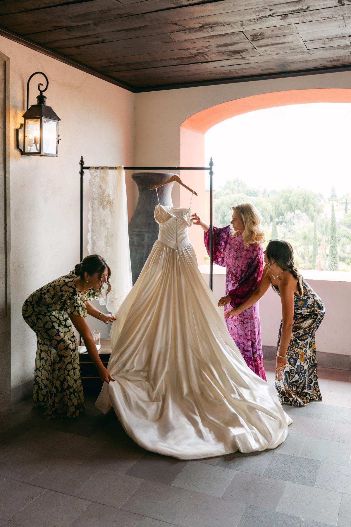
2. Cover Every Chapter of the Day
A gallery that works reads in order. Getting ready, the details, the portraits, the ceremony, cocktail hour, the reception, the last dance. When every chapter is present, an editor can move a reader through the day without stopping to explain a jump.
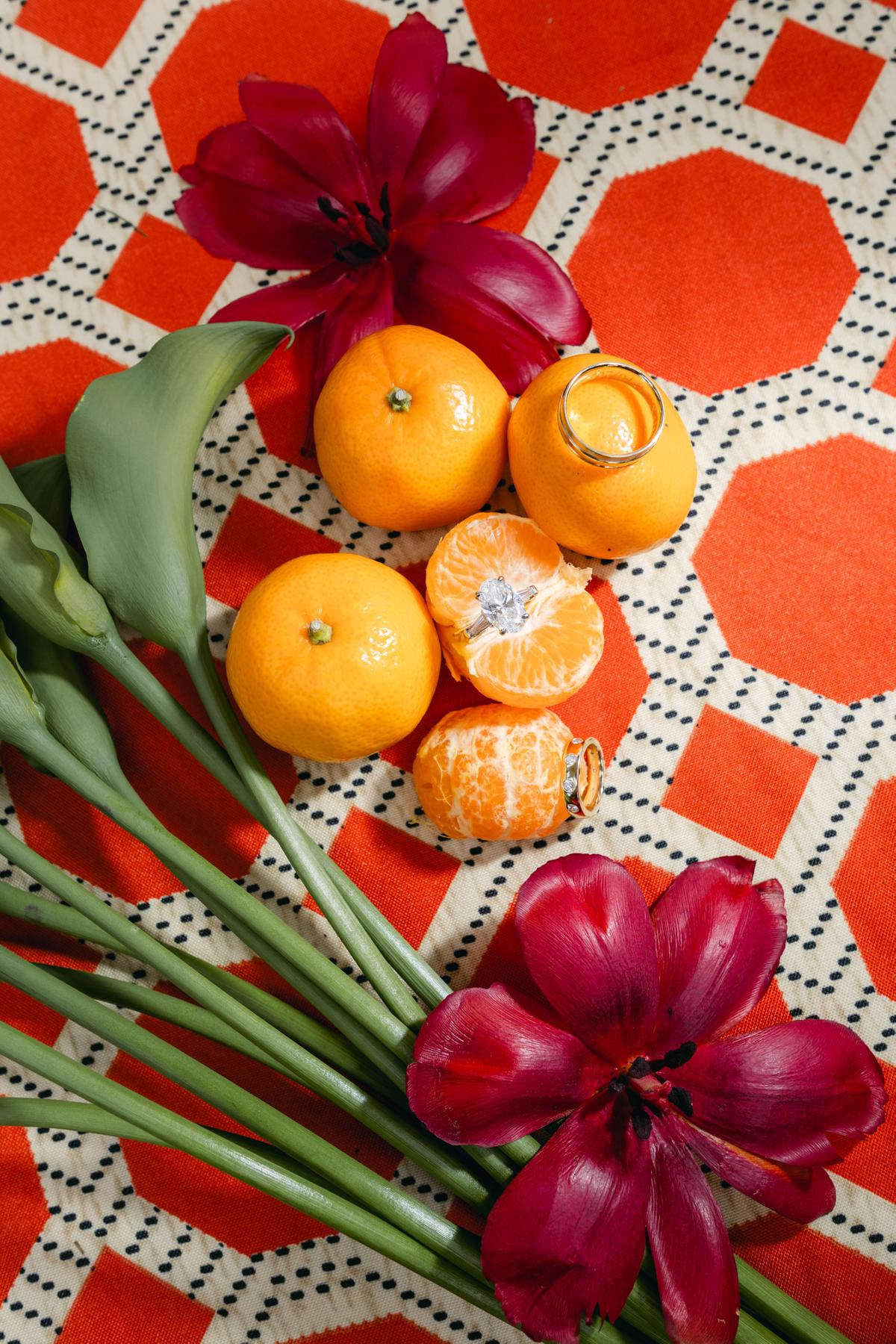
The chapters that go missing are usually the quiet ones. Flat lays, meaning the overhead arrangements of invitations, rings, shoes and heirlooms styled together on a surface, get skipped more than anything else, and they are often what a feature opens with. Getting-ready moments go the same way. So do the details that cost real money and are now invisible: the centerpieces, the favors, the signage, the escort display.
The requirements name these outright, asking for the bride and her fashions, the wedding party, the groom, flowers, centerpieces, decor elements, favors and invitations, and calling detail shots very important in considering a wedding for publication.1 The same passage asks for those details in healthy balance with the story: the getting ready, the people, the moments.
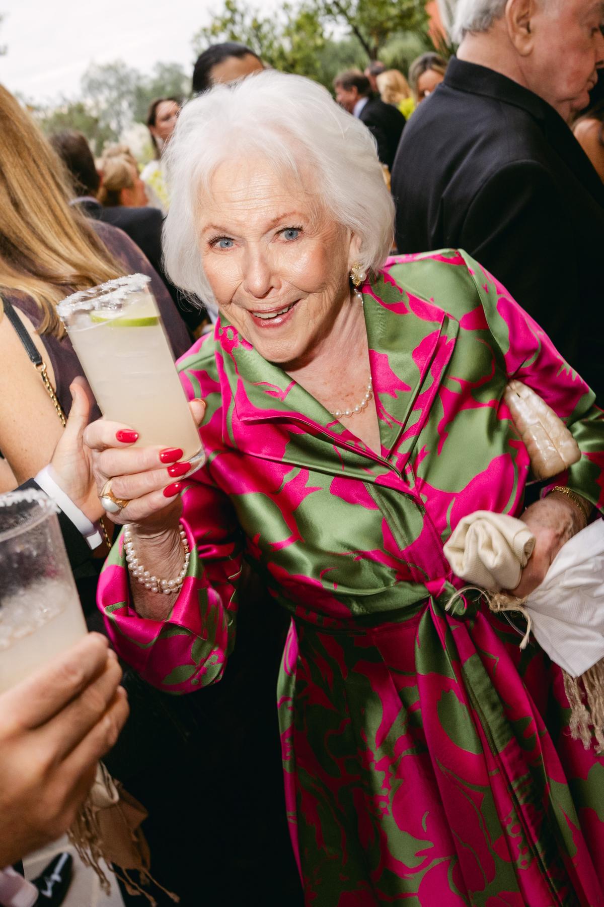
One caution on guests. Candid guest moments belong in the gallery, and the best of them carry more feeling than any posed frame. The requirements are direct about volume, though, saying they do not want too many images of guests dancing, no matter how beautiful they are.1 Send a handful of the strongest rather than the forty you shot on the dance floor.
Practical step: Put the gallery in chronological order and read it as a table of contents. Any chapter holding one frame or none goes back to the take.
3. Lead With Color, Pepper In Black and White
Color leads. The requirements say it plainly, that color photos look best on the blog.1 The reason is structural. A Style Me Pretty feature is built around a palette. The description talks about the palette, the couple chose vendors around it, and readers arrive looking for it.
A gallery converted heavily to black and white removes the one thing the feature is organized around. The flowers stop being coral. The linens stop being chartreuse. The wedding becomes a set of shapes, beautifully rendered, and impossible to write a color story about.
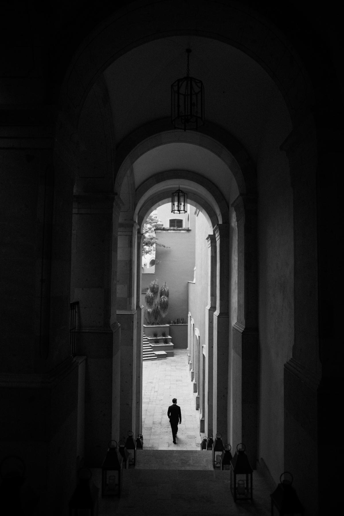
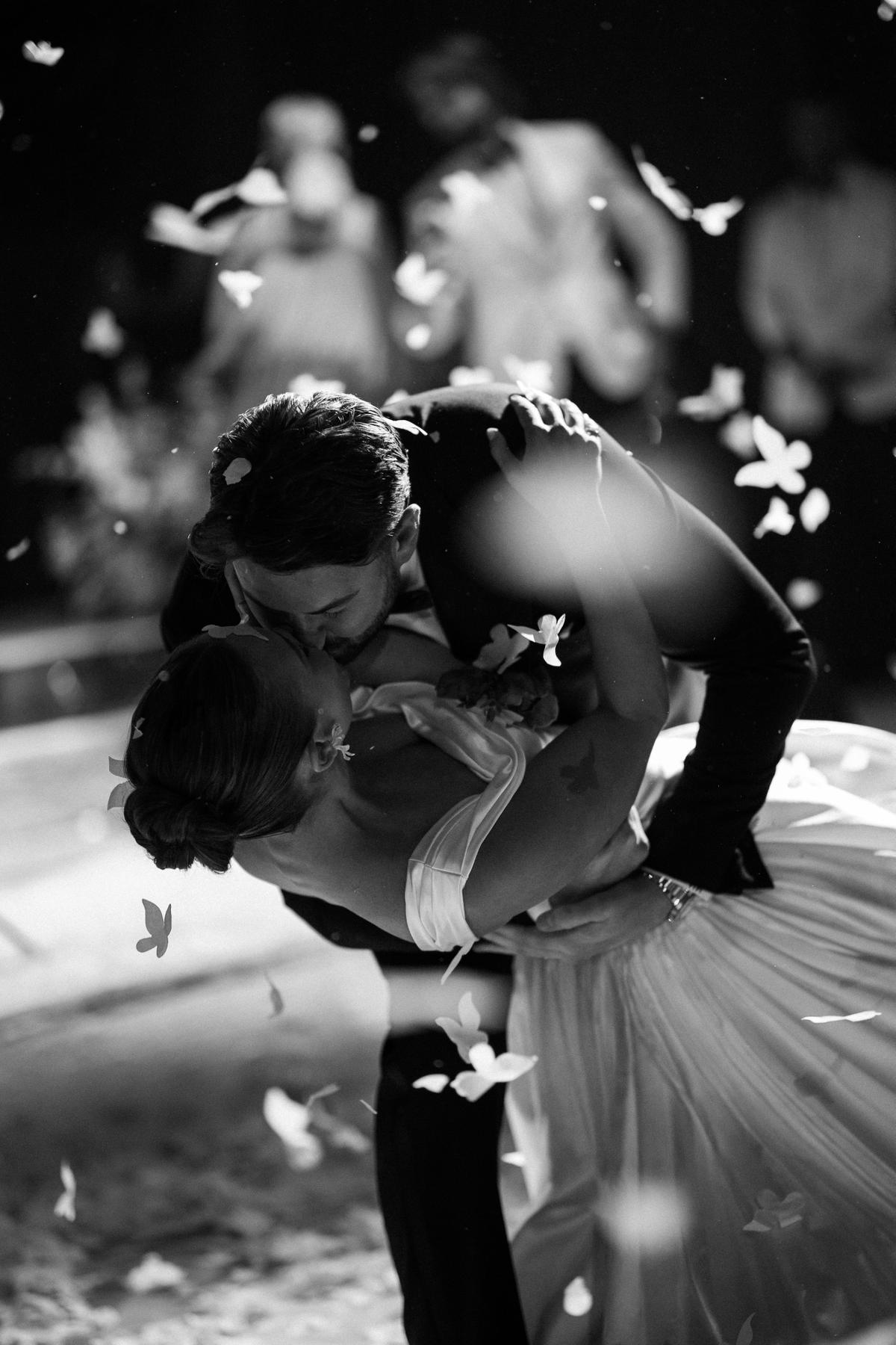
Black and white still belongs in there. The requirements describe it as peppered in, and ask for a very select group.1 The frames that earn it are the ones where monochrome does something the color version cannot: a face in hard light, a crowded dance floor, a moment where the color was frankly a distraction.
Practical step: Count your black and white frames as a share of the whole. If it is more than a small handful, restore the ones that were converted out of habit and keep the few that were converted for a reason.
Want to join the Style Me Pretty vendor directory for just $99?
4. Go Vertical, and Mean the Horizontal Ten Percent
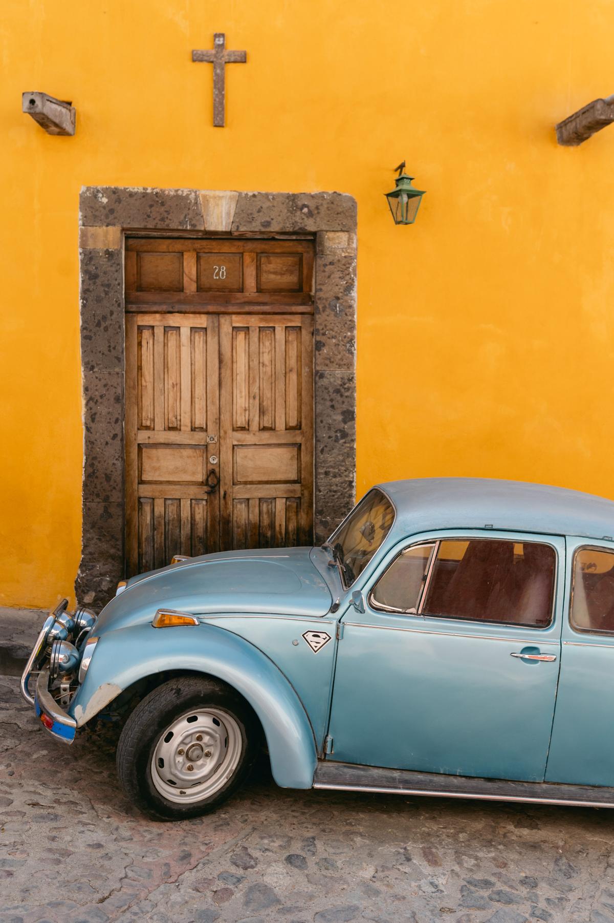
Vertical imagery is best, with about 10% horizontal.1 The reason is layout. The blog renders galleries in a consistent column, so a run of vertical frames stacks cleanly while horizontals interrupt it. Send mostly vertical and your submission slots into the format the site already uses.
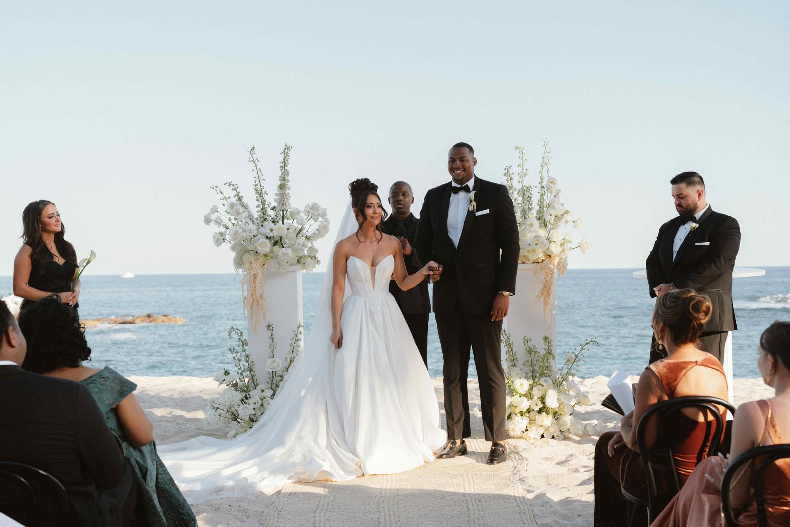
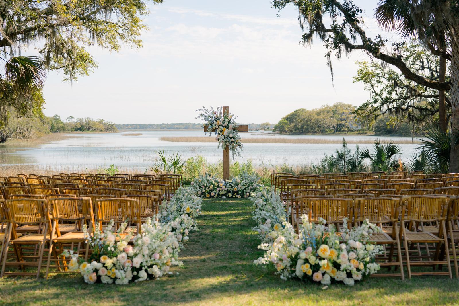
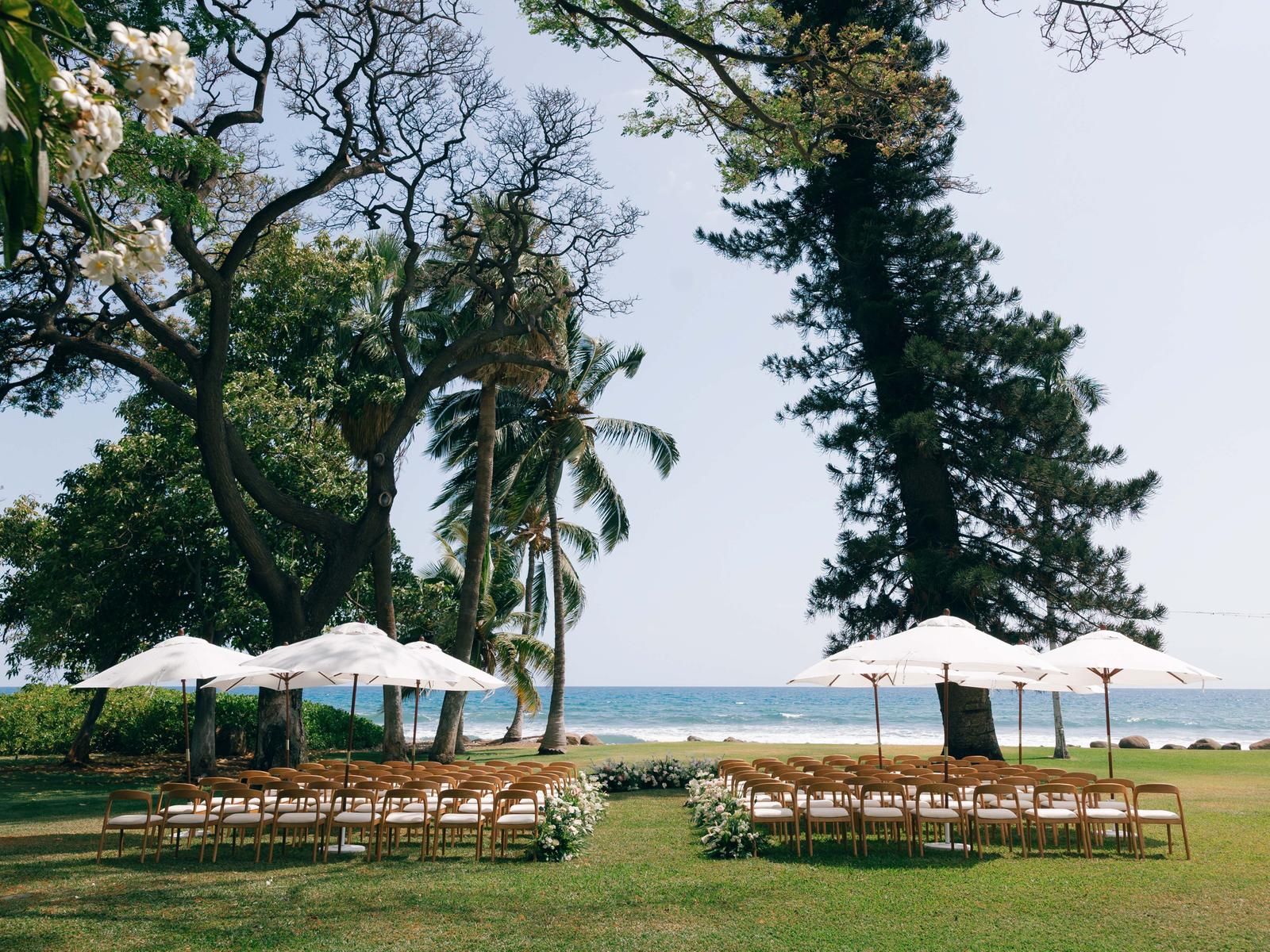
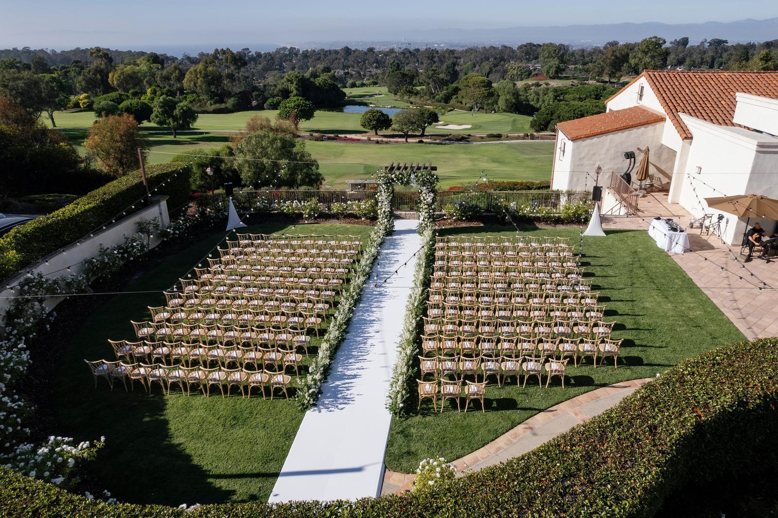
That ten percent still matters. On a 120-image gallery it works out to roughly twelve horizontal frames, and they carry a specific load. Wide establishing shots. The aisle before anyone sits down. The reception with the whole room in it. The frames that tell a reader where they are.
The image at the top of a published feature is horizontal. When a gallery arrives without a single usable landscape frame, that slot gets filled by cropping a vertical one, which means somebody is cutting the top and bottom off your composition to make it fit.
Practical step: Do the arithmetic on your own gallery. If you land near ten percent horizontal, check that at least one of them is a wide establishing frame strong enough to open the feature.
5. Clean, Simple, and Not Overly Fussed With
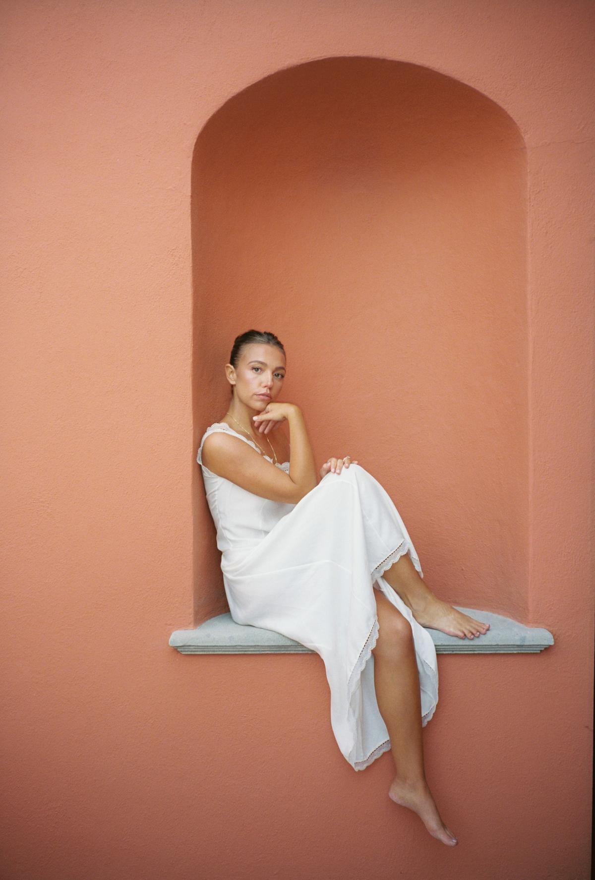
Style Me Pretty has a distinct visual identity, and the Little Black Book's own guidance describes it in three phrases: film-focused imagery, light and airy compositions, editorial styling.2 Underneath those sits a simpler preference. The team gravitates toward photographs that have not been overly fussed with.
In practice that means a clean composition with one clear subject, styling that reads as considered rather than staged, and a light hand in the edit. Heavy grading, aggressive vignetting and grain applied afterwards all read as effort, and effort is the thing an elevated feature is meant to hide.
The frames that lose out are the busy ones. A tablescape shot from an angle where three other tables intrude. A portrait with a catering van parked in the background. A detail shot where the detail competes with four other details. These are often technically fine photographs that simply have too much in them.
Practical step: Open your ten strongest frames and say out loud what each one is of. If it takes a full sentence, the frame is too busy for the slot you are hoping it fills.
6. Make Every Frame Earn Its Place
The last pass is the hardest, because it means cutting photographs you like. Every image in a submitted gallery should clear three bars. It should stand up on its own. It should add something to the story that no other frame adds. And it should sit comfortably beside its neighbors in color, tone and style.
The third bar is where cohesion comes from. The second is where most galleries fail. Three frames of the same toast from slightly different positions all clear the first bar and none of them clear the second. To you they are three distinct moments, because you remember standing there. To an editor scrolling, they are the same photograph three times, and the gallery starts to feel padded.
Categories work the same way. A gallery that runs forty percent portraits of the couple reads as thin no matter how good the portraits are, because the rest of the day went missing to make room for them.
Practical step: Find every pair in your gallery that would read as the same photograph to someone who was not there. Keep the better one.
The Bigger Picture
The editorial process on the other end is balance and storytelling. A gallery that arrives complete lets an editor guide a reader from getting ready to the last dance, alternate wide moments with close-up details, and show the thoughtfulness behind choices the couple spent a year making.
When that happens, the finished feature looks effortless. That is the point, and it is also the illusion. It reads that way because the curation already happened, before the submission was sent, by the person who was actually in the room.
Curate with intention. Think like an editor. Send a day someone can step right into.
Sources
- Style Me Pretty submission guidelines, the live requirements page every submission is measured against, and the source for the image count, dimensions, file size, orientation, color and shot-list requirements described here. View the guidelines
- The Scoop: imagery, published by the Style Me Pretty Little Black Book on Instagram, April 15, 2026. The eleven-slide carousel is our editorial team's own guidance on curating a gallery, and the source for the aesthetic described here.
Credits
Photographs from a sun-drenched yellow garden wedding at Rosewood San Miguel de Allende, published on Style Me Pretty in August 2026.
Additional Credits
Event Planning, Floral Design: Gonzalez + Helfon | Wedding Dress: Danielle Frankel | Groom's Attire: Ralph Lauren | Wedding Venue: Rosewood San Miguel de Allende | Music: Eli's Band | Beauty: Lighthouse Cinematic Productions | Signage: Marielle Hawitt | Reception Dress: Patty Ann Voto